


(Part Two) Let's talk about COLORS!

Updated: 6 days ago
In this part, let's talk about how to choose color by according customer's occupation.
Color scheme preferred by female and the character for female. Hope this will be helpful reference for designer to combination the right color to consumers.
Choose color by according customer's occupation.
1. Financial industry color scheme
We mentioned on Part One, blue can reflect the feeling of honesty, steadiness and success. Banks, insurance and other institutions with high requirements reliability are always appear in blue. If the consumer who in the financial industry, color can inclined in blue. Example: BLEU ELECTRIQUE + MOUTARDE + GRIS PERLE + BLEU DE PRUSSE

2. School color scheme
Blue reflects trust and reliability, and blue also draws attention. Consumer in the teaching profession can be given a choice of formal blue. Example: BLEU AZTEQUE + GRIS PERLE + BLEU ELECTRIQUE

3. Medical industry color scheme
Green can reflect the feeling of nature, environmental protection, health, and have the healing effect such as eliminating fatigue. No matter medical industry trademarks or pharmaceutical packaging are commonly used green elements. Consumer who in medical industry can choose green mainly. Example: MALACHITE + CRAIE SW + BAMBOU

4. Design industry color scheme
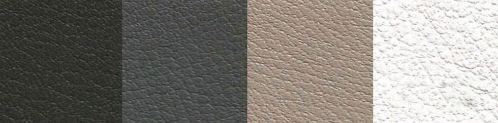
Commonly used black, white to build fashionable style, reflect contracted. Black has advanced feeling, reflect sedate feeling from it. White reflects bright feeling and clean feeling. Example: NOIR + GRAPHITE + GRIS TOURTERELLE + BLANC
Color scheme of female character.
Red and pink is the color that female always favors, also are the delegate color of the female. For example, the daily signs in women's rest room are mostly red. Pink and red are also essential colors for women-oriented fashion magazines. So let's talk about the color scheme that meets difference female characters.
1. Sexy, seductive impression color scheme
Purity color like Purple or deep red combine with noir, intense contrast the seductive. Example: ULTRAVIOLET + ROUGE TOMATE + RAISIN + NOIR

2. Dynamic impression color scheme
Orange means sunshine, vigor and happy. Red can reflect dynamic, active. Choose the warm color such as red and orange can shows a vigor and healthy impression. Example: ROSE JAIPUR + CAPUCINE + LIME + ORANGE POPPY


3. Refreshing impression color scheme
Example: BLEU ATOLL + BLEU PARADIS + CRAIE SW + BAMBOU

4. Elegance and connotation impression color scheme
Should avoid as far as possible contrastive and intense colour. Choose small hue contrast color scheme will annotate the impression with feminine grace. Red and light purple is a good choice. Example: ROSE TYRIEN + ROSE THE + FLAMINGO

5. Leisured impression color scheme
Example: SOLEIL + MALACHITE + BAMBOU + LIME

6. Romantic and cute color scheme
Example: PINK + ROSE SAKURA + BLANC


Comments